
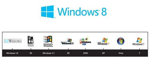
Microsoft is making lots of changes with its Windows 8 operating system and that's now extended to a new logo as Principal Director of User Experience for Windows, Sam Moreau revealed a new Metro UI based Windows 8 logo It’s a window… not a flag.
Sam Moreau writes about the thinking behind the design on the Windows Team Blog:
With Windows 8, we approached the logo redesign with a few key goals on mind.
1. We wanted the new logo to be both modern and classic by echoing the International Typographic Style (or Swiss design) that has been a great influence on our Metro style design philosophy. Using bold flat colors and clean lines and shapes, the new logo has the characteristics of way-finding design systems seen in airports and subways.
2. It was important that the new logo carries our Metro principle of being “Authentically Digital”. By that, we mean it does not try to emulate faux-industrial design characteristics such as materiality (glass, wood, plastic, etc.). It has motion – aligning with the fast and fluid style you’ll find throughout Windows 8.
3. Our final goal was for the new logo to be humble, yet confident. Welcoming you in with a slight tilt in perspective and when you change your color, the logo changes to reflect you. It is a “Personal” Computer after all.
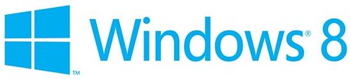
I really liked the new Windows 8 logo. What about you?
Source:- Windows Team Blog
0comments:
Post a Comment